
Bar chart using measures in Power BI
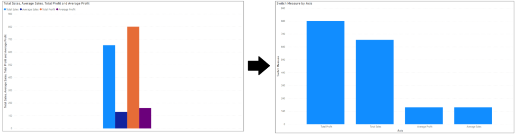
Today we’ll be learning to create bar chart using measures. As shown below. At times we need to create bar chart using the created measures but by default it create column chart but without any gap between bars.
As you can see the difference below I’m telling about. Very simple and easy to follow tutorial
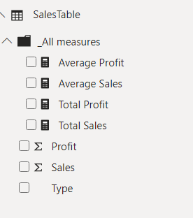
So I’ve 4 created 4 measures Total sales, Total Profit, Average sales and average profit as shown in the image below and I want to create the bar chart with proper distance between them.
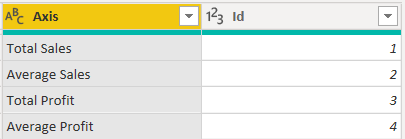
Create a new table (AxisTable) and list of measures and the ID column as shown in image below. you can add as many values as you want to bring in the bar chart. Here I’ve added 4 values in the Axis column. ID column is for ranking or position of the bar.
New create a measure for final charting
Switch Measure =
SUMX (
AxisTable,
SWITCH (
[Id],
1, [Total Sales],
2, [Average Sales],
3, [Total Profit],
4, [Average Sales]
)
)
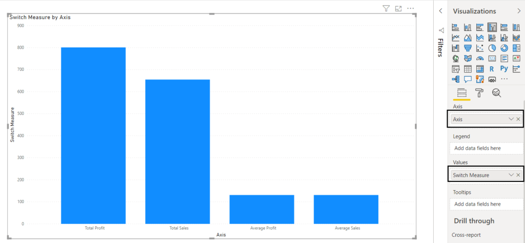
Creating the view put the Axis column in axis and Switch Measure in values and that’s done
Keep visiting Analytics Tuts for more tutorials.
Thanks for reading! Comment your suggestions and queries
2 qstns,
-I can’t understand if there’s a relation between sales table (where measures are grouped in) and the new one (Axistable)
-Where do You create the Switch measure
Thanks!
Hi Paolo, new table has to be created in the Power BI as static table and then you can use in the switch measure.
Pingback: Dynamic Measure and Dimension in Power BI - Analytics Tuts
Thanks you very much. This helped me a lot. good solution
Very helpful! Tanks
This is awesome. It works!
This is great. Thank you.
This was simple and super helpful! thank you!