
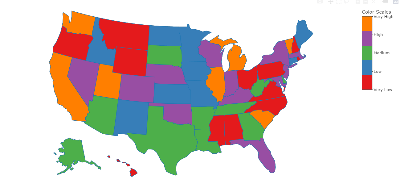
Color USA map based on a Categorical variable using Plotly in R
Hello friends! we’ll be learning to create the Color USA map based on a Categorical variable using Plotly in R. Very simple and reusable code in tutorial.
Data
| State | Sales |
| AL | High |
| AK | Medium |
| AZ | Medium |
| AR | Medium |
| CA | Very Low |
| CO | Very High |
| CT | Low |
| DE | Medium |
| FL | Very High |
Code
Following reusable code can be applied to any other dataset.
Load library
library(dplyr)
library(plotly)
library(htmlwidgets)
library(RColorBrewer)
Load data
df <- read.csv("states.csv")
Factoring
df$Sales = factor(df$Sales)
df$val = as.numeric(df$Sales)
nfactor = length(levels(df$Sales))
colr <- brewer.pal(n = nfactor,name = "Set1")
levels(df$Sales) <- c("Very Low" , "Low", "Medium", "High", "Very High")
names(colr) = levels(df$Sales)
colrS = function(n){
CUTS = seq(0,1,length.out=n+1)
rep(CUTS,ifelse(CUTS %in% 0:1,1,2))
}
Creating color data frame
colorScale <- data.frame(z=colrS(nfactor),
col=rep(colr,each=2),stringsAsFactors=FALSE)
Plotting Map
p <- plot_ly( data = df, type = "choropleth", locations = ~ State, locationmode = "USA-states", z = df$val, colorscale= colorScale, # or "Greens", colorbar=list(tickvals=1:nfactor, ticktext=names(colr)) ) %>%
layout(geo = list(scope = "usa")) %>%
colorbar(title = "Color Scales")
p
Saving Map as html file
saveWidget(p, 'USA Map.html')
Keep visiting Analytics Tuts for more tutorials.
Thanks for reading! Comment your suggestions and queries
Thanks so much for this. Where can I find the states.csv file?