
Correlation matrix in Excel, Python and R
Hello friends!! today we’ll learn to make correlation matrix in Excel, Python and R. Also we’ll be creating correlation matrix heatmap in Excel, Python and R.
Correlation Matrix in Excel
We’ll start with Excel. First activate the Data Analysis tools package in Excel if not already check out here on how to activate the Data Analysis tools in excel or here .
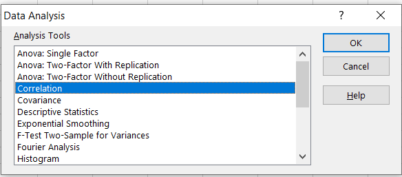
From Menu select Data > Data Analysis option.

New dialogue box will open
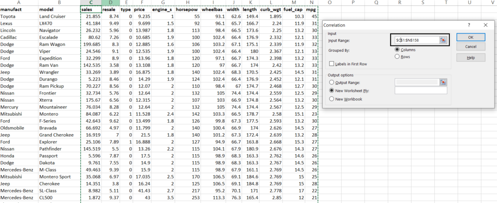
Now select the numerical data in the Input Range and select the output range for the output matrix and press OK.
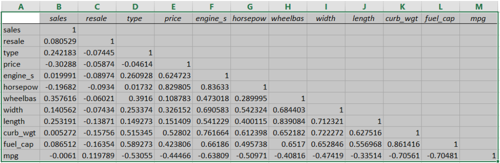
Once the steps followed a new output sheet will be created as shown in image below.
Correlation Matrix in Python
Start with importing libraries
import pandas as pd
import seaborn as sb
Read data
input = pd.read_csv('Data.csv')
Generating correlation values
CorMatrix = input.corr()
CorMatrix.head()   # will return the top 5 rows
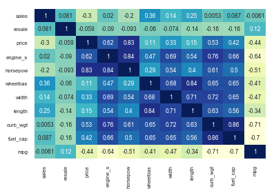
Now creating the heatmap
sb.set(font_scale=0.7)   # set the font scale at 0.7
sb.heatmap(CorMatrix, annot=True, cmap="YlGnBu", cbar=False)
annot - will return the correlation values inside the matrix
cmap - Color the show
cbar - Show/hide the color bar
Correlation Matrix in R
Check out the Correlation Matrix in R here I’ve already written the detailed post about it.
Keep visiting Analytics Tuts for more tutorials.
Thanks for reading! Comment your suggestions and queries