
Donut Chart in Tableau
Donut Charts can be an effective way to show the comparisons in a unique way (Tableau workbook can be find in the end of the post).
I will be using Sample-store data(available on Tableau desktop as sample data).
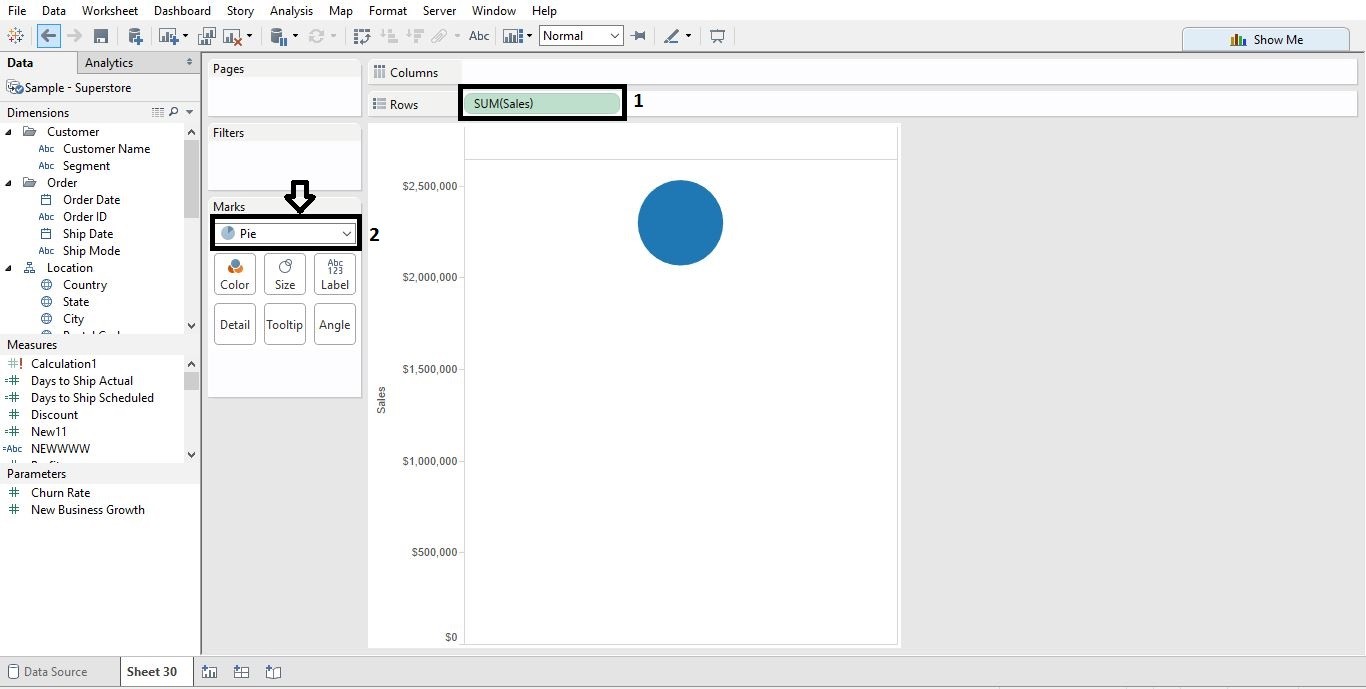
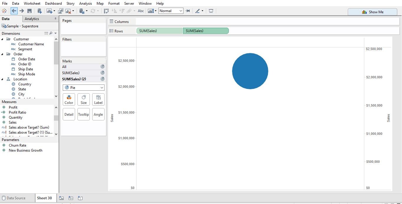
Step 1. Pie Chart
a. To create the Donut chart first we have to create a Pie chart, put the sales in Rows shelf and change the chart type to Pie chart.
b. Put sales one more time in Rows shelf.
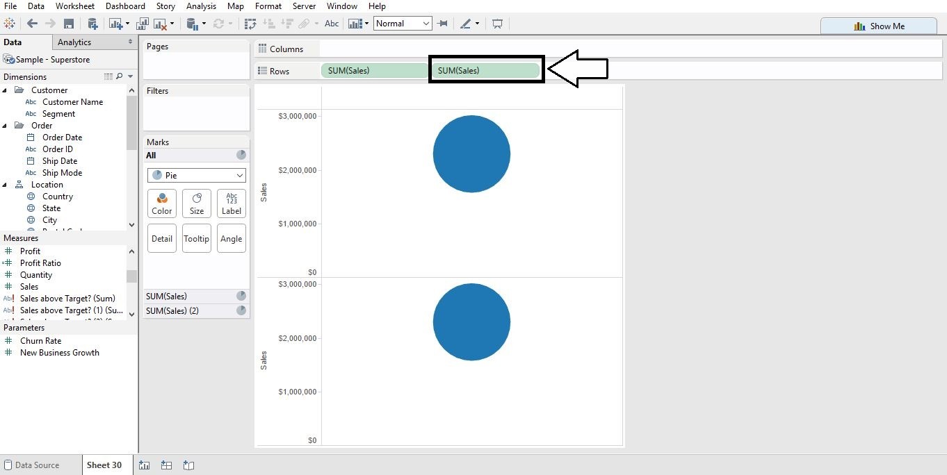
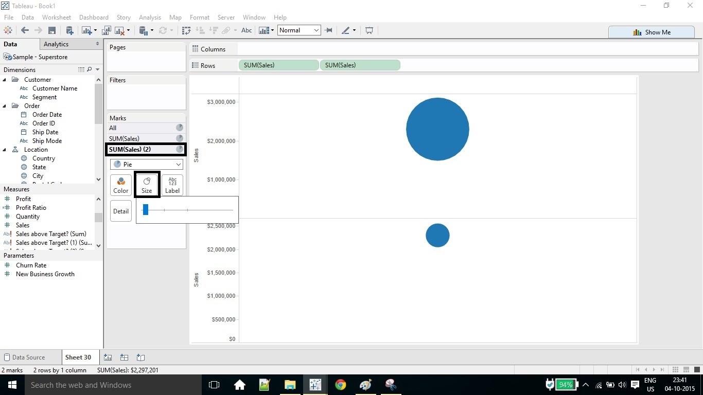
c. Decrease the size of 2nd pie chart.
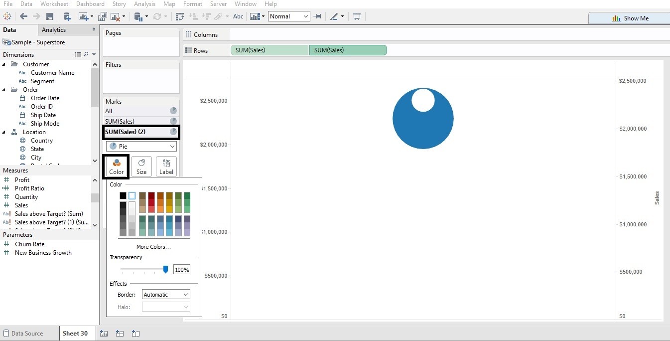
Step 2. Dual Axis Chart
a. Now using the dual axis chart place the one on the top of other.
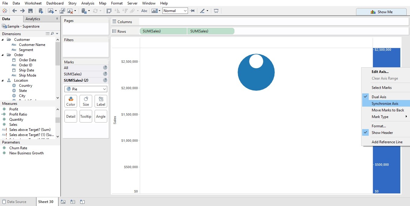
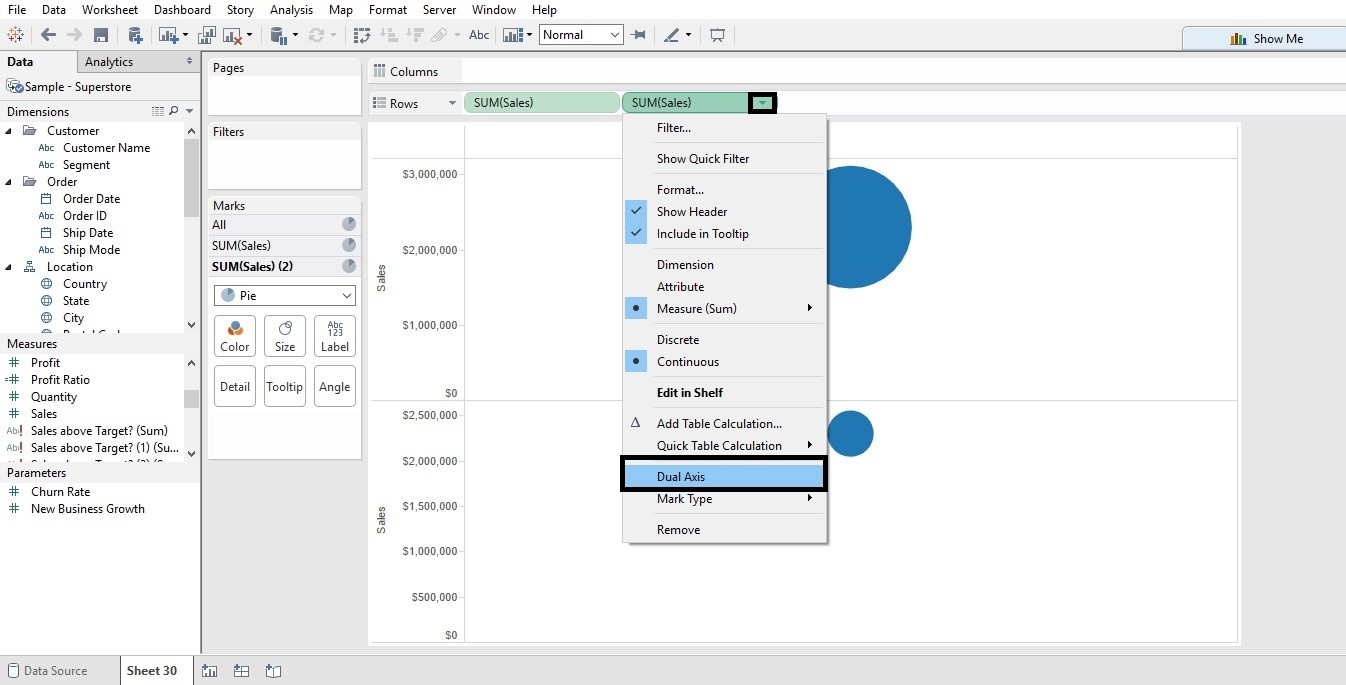 after dual axis you’ll see this (don’t worry 2nd pie chart is on the top of 1st )
b. Change the color of 2nd pie chart to white.
c. Now use Synchronize axis change the size of 2nd pie for the width you want.
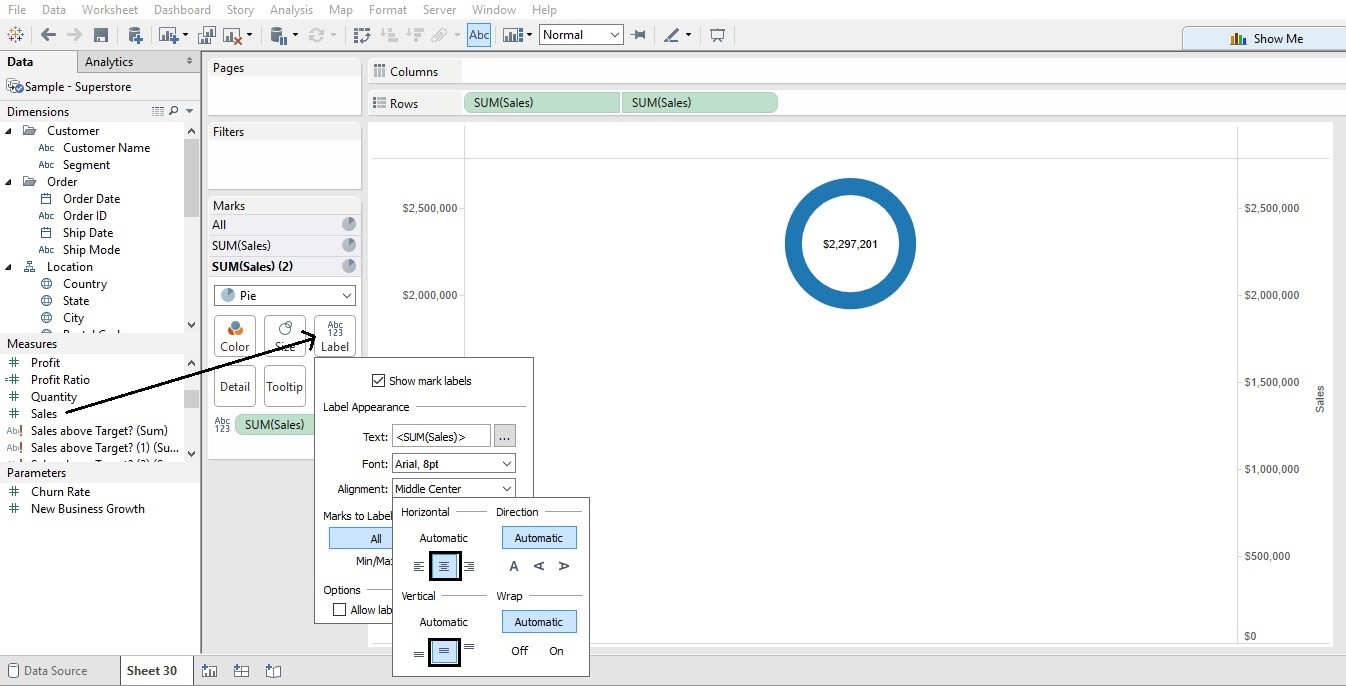
d. for the label put sales into the label and adjust the position.
Note: For better Visualization don’t use more than 4 or 5 slices in the pie chart.
How to show pie chart with different measure values and their respective % values?
Hi Mausami,
Thanks for reaching out! Create Pie chart and put the dimension in Angle and that’s done. Please have a look here Labour Performance else mail me @ contact@analytics-tuts.com.
Thanks
Niket (Admin)