
ggplot2 in R
ggplot (data = data used for plot, aes=(mappings)) + geom_functions
geom_function is the layer used to create the plot.
we’ll see the detailed description with the examples.
install.packages("ggplot2")
library(ggplot2)
> head(iris)
  Sepal.Length Sepal.Width Petal.Length Petal.Width Species
1          5.1         3.5          1.4         0.2  setosa
2          4.9         3.0          1.4         0.2  setosa
3          4.7         3.2          1.3         0.2  setosa
4          4.6         3.1          1.5         0.2  setosa
5          5.0         3.6          1.4         0.2  setosa
6          5.4         3.9          1.7         0.4  setosa
Plot  <-  ggplot(data= iris, aes(Sepal.Length, Sepal.Width))
                                        + geom_point()
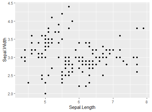
Scatter Plot
Plot1 <-  ggplot(data= iris, aes(Sepal.Length, Sepal.Width,color=Species))
+ geom_point()
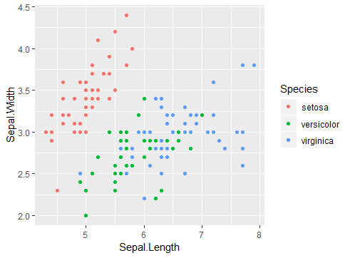
Scatter Plot with color
Plot2 <- ggplot(data= iris, aes(Sepal.Length, Sepal.Width))
+ geom_line()
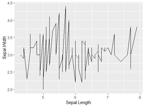
Line Plot
Plot3 <- ggplot(data= iris, aes(Sepal.Length, Sepal.Width,color=Species))
+ geom_point() + geom_line()
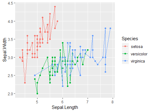
Dual Axis Plot
Plot4 <- ggplot(data= iris, aes(Sepal.Length, Sepal.Width,color=Species))
+ geom_point() + geom_smooth(method ="lm")
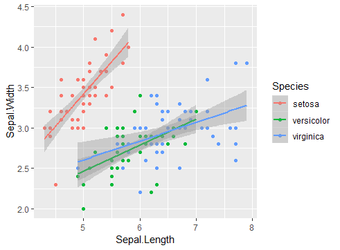
Smoothing Model Plot
Plot5<- ggplot(data= iris, aes(Sepal.Length, Sepal.Width,color=Species))
+ geom_point()+ facet_wrap(~Species, nrow=2, ncol=2)
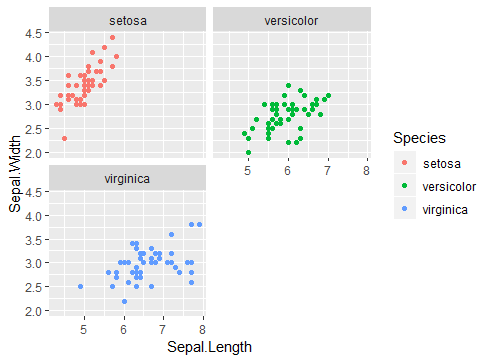
Facet Wrap in ggplot
Extensions to ggplot2
There are few more packages which are extension of ggplot2. We’ll see ‘GGally’ and gridExtra package.
GGally– Plot all possible relations from the dataset using GGally using the following command:
install.packages("GGally")
library(GGally)
ggpairs(iris)
As we can see in the image below ggpair is plotting all possible relations in the available data set. Can be a starting for doing EDA but be careful if dataset is large it can take long time to produce the result. I’ve provide documentation link the resource section below.
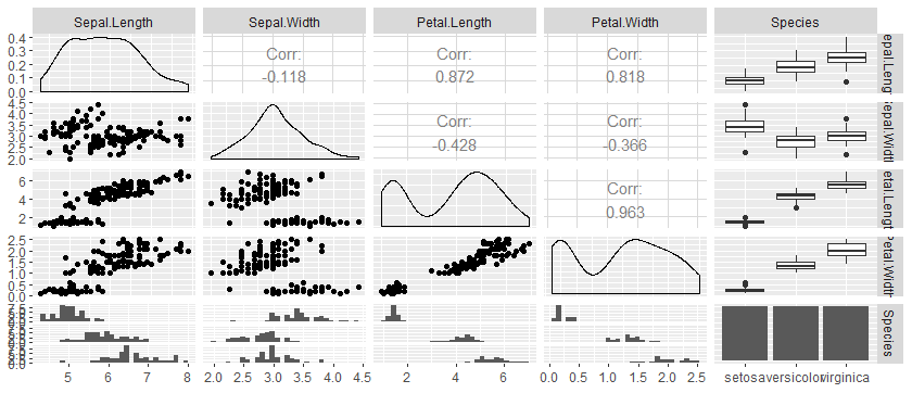
ggpair
gridExtra– Using gridExtra we can combine multiple plots in single output window just like a dashboard easy to use and apply. Using the following command.
install.packages("gridExtra")
library(gridExtra)
#grid.arrange(list of plots to combine, nrow, ncol)
grid.arrange(Plot1, Plot3, ncol=2)
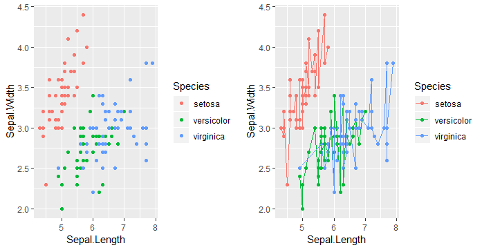
gridExtra
Further readings and resources:
Keep visiting Analytics Tuts for more tutorials.
Thanks for reading! Comment your suggestions and queries.
Pingback: dplyr in R – Analytics Tuts