
How to prevent Overplotting in data analysis
Hello friends! Overplotting is one of common issue faced by analysts during EDA (Exploratory data analysis), data visualization and getting inference the results. We’ll see few methods to prevent it.
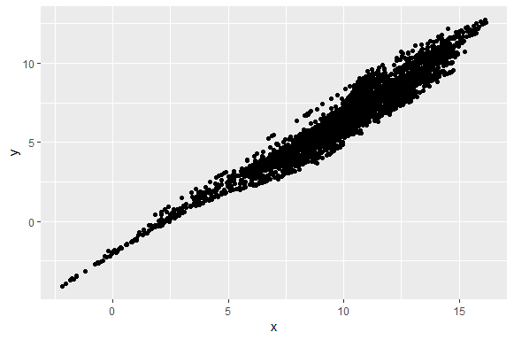
As you can see in the scatter plot below. Points are overlapping which makes scatter plot unreadable.
Plot <- ggplot(data = df, aes(x,y))+ geom_point()
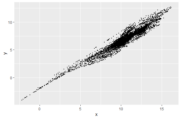
Plotting the points with smaller size
This plot looks much better than the previous plot and the plots are more dense towards the upper side which was missing in the previous plot. The circles are half the size from the old plot.
Plot1 <- ggplot(data = df, aes(x,y))+ geom_point(size=0.5)
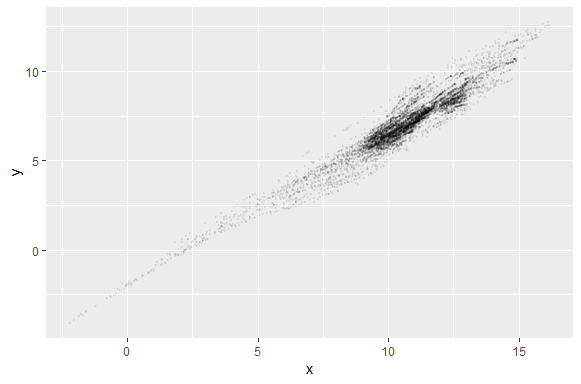
Increasing Transparency
By increasing the transparency we can make it more readable. In this plot transparency is 0.05 or 1/20 which means it takes 20 circles to make a complete darker circle. Again this looks more readable and upper side of the scatter plot is more darker and dense.
Plot2 <- ggplot(data = df, aes(x,y))+ geom_point(alpha= 1/20, size=0.5)
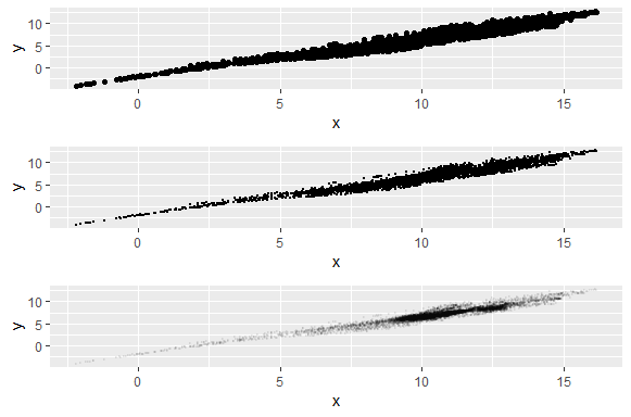
Plotting the all plots together using gridExtra package. You can see the difference between the plots.
grid.arrange(Plot, Plot1, Plot2)
Few more methods are:
> Grouping
> Coloring based on some dimensions
> Faceting
Check: Avoid overplotting with python
Keep visiting Analytics Tuts for more tutorials.
Thanks for reading! Comment your suggestions and queries.