
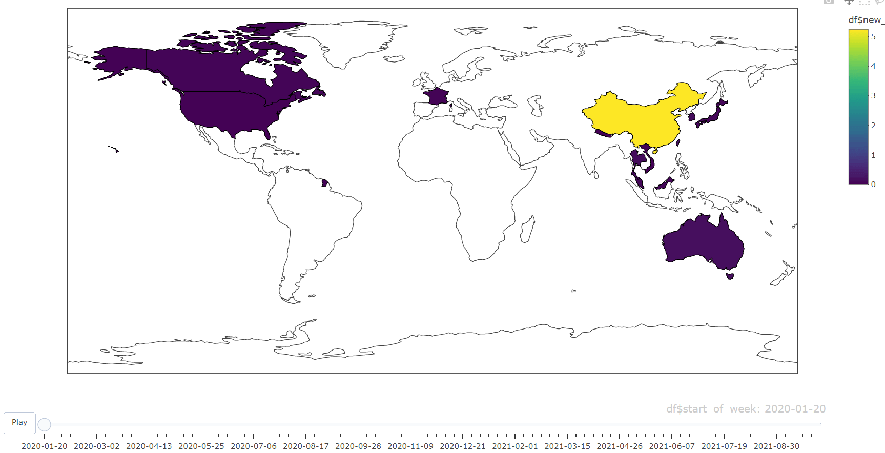
Map with time slider using Plotly in R
Hello friends! we’ll be learning to create the map with time slider using plotly in R. Very simple and reusable code in tutorial.
Data
Data is as shown below with country, covid cases and date fields.
| country | new_cases_per_million | start_of_week | code |
| Afghanistan | 0.021428571 | 24-02-2020 | AFG |
| Afghanistan | 0.150142857 | 02-03-2020 | AFG |
| Afghanistan | 0.366 | 09-03-2020 | AFG |
| Afghanistan | 1.298 | 16-03-2020 | AFG |
| Afghanistan | 3.579142857 | 23-03-2020 | AFG |
| Afghanistan | 5.820428571 | 30-03-2020 | AFG |
| Afghanistan | 8.441857143 | 06-04-2020 | AFG |
| Afghanistan | 9.994571429 | 13-04-2020 | AFG |
| Afghanistan | 20.39828571 | 20-04-2020 | AFG |
Code
Commented code as following with the data
#load library
library(dplyr)
library(plotly)
library(htmlwidgets)
#load data
df <- read.csv("graph.csv")
#create map
p <- plot_geo(df, locationmode = 'world') %>%
add_trace( z = ~df$new_cases_per_million, locations = df$code, frame=~df$start_of_week,
color = ~df$new_cases_per_million)
#export as html file
htmlwidgets::saveWidget(p, file = "map.html")
Keep visiting Analytics Tuts for more tutorials.
Thanks for reading! Comment your suggestions and queries