
Progress Bar Chart in Tableau
Today we’ll be learning to creating Progress Bar Chart in Tableau. I’ll be using superstore data of the tutorial.
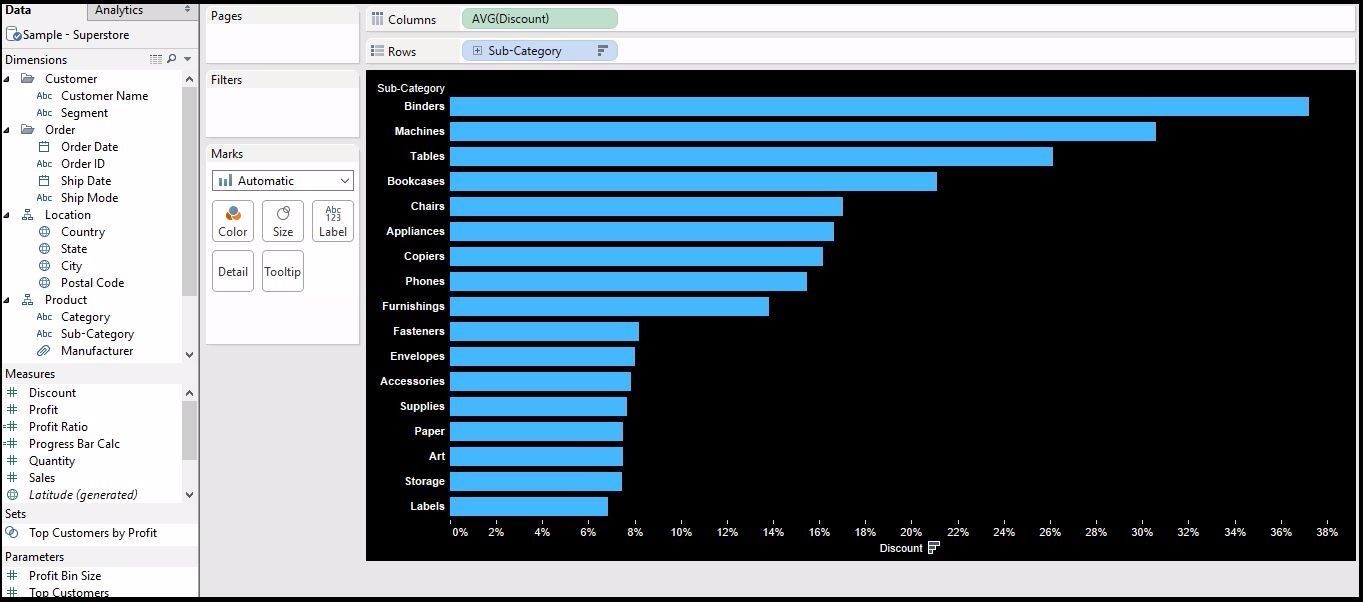
In the first step we’ll create a basic bar chart. So put discount in the Columns shelf and Sub-category in Rows shelf.
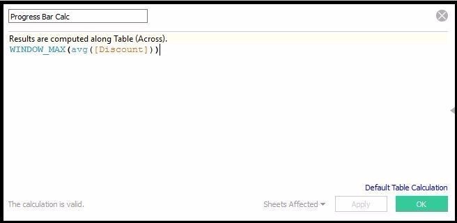
Now we’ll create a calculate field. For that go to analysis > create calculated field as shown in image below.
WINDOW_MAX(AVG([Discount]))
WINDOW_MAX()-
Returns the maximum of the expression within the window. The window is defined by
means of offsets from the current row. Use FIRST()+n and LAST()-n for offsets from
the first or last row in the partition. If the start and end are omitted, the entire
partition is used.
Now add the calculated field we just created to the Columns shelf.
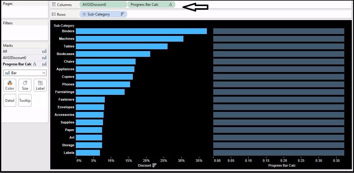
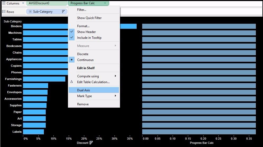
Now make it dual axis.
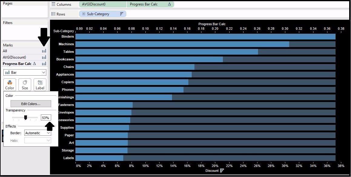
We’ll see some thing like this. First of all make sure all the chart type should be Bar type and then change the transparency to somewhere around 50% and change the background to black(optional).
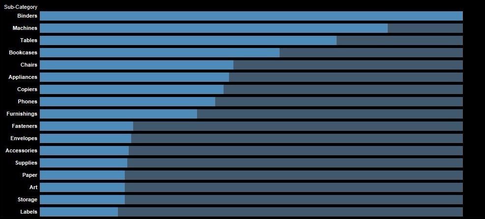
After some formatting we’ll get the following viz.
So that’s done about the progress bar chart in Tableau. It can be used to make your final dashboard or Presentation look better.
Keep visiting Analytics Tuts for more tutorials.
Great! Thanks a lot, Niket. I was wondering if we can do this using a Pie or Doughnut chart. If I have Total sales volume and I want to show the share of sales based on a filter (say based on time) to overall sale, how can we show that in a Pie or Doughnut chart? Can you help me with that? Cheers!
Yes you can do the same with pie/doughnut chart Please download this dashboard and change the color.Labour Performance
If you couldn’t able to get your desired result mail me(Check out about page).