
Quadrant Chart in Tableau
Today we’ll be learning to create Quadrant Chart in Tableau. I have used ‘World Indicators’ data for the tutorial. Tableau workbook is attached for download.
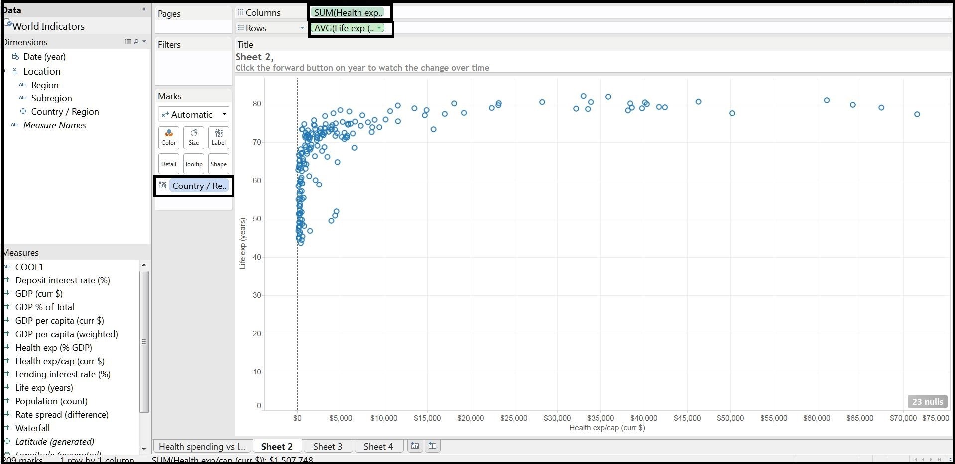
Step 1: Creating Scatter plot
In the First step we’ll be creating a basic scatter plot. Put the relevant dimension and measure in column and rows shelf and then Country/Region dimension to the Label from marks card.
Step 2: Creating Quadrants
In this step we’ll be creating Quadrants in the Chart. For this follow these steps:
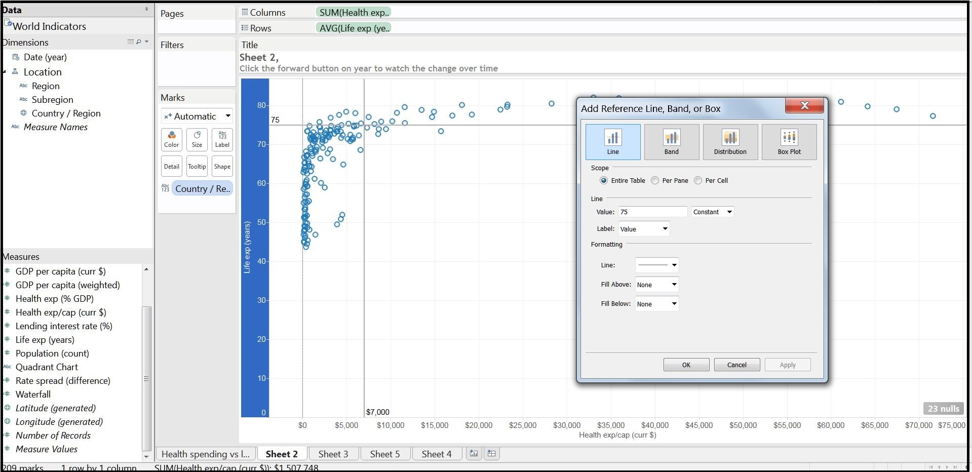
a. First we’ll be creating Y-axis. For that right Click on the bottom of Column shelf header and select the ‘Add Reference Line’ option. 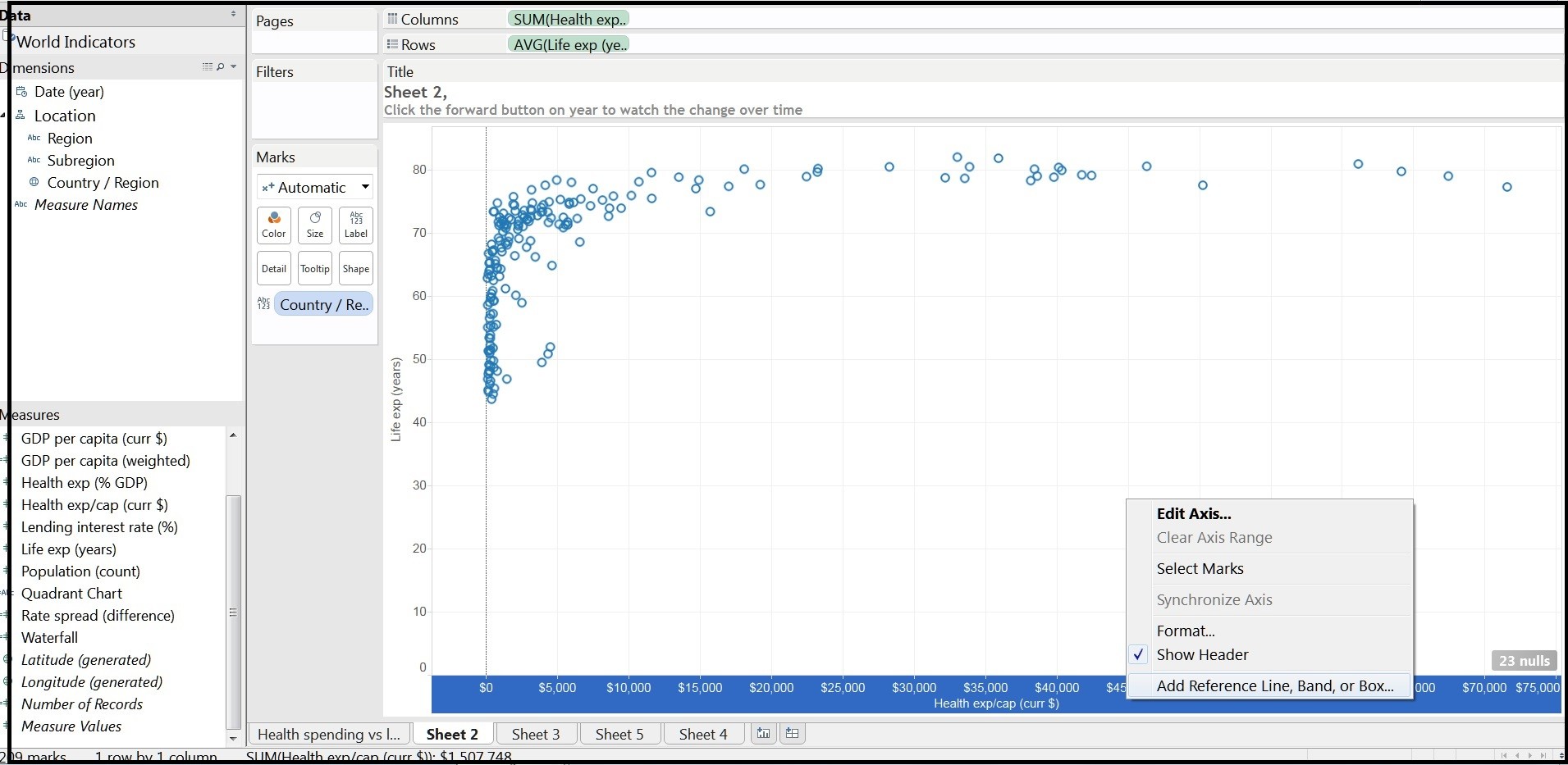
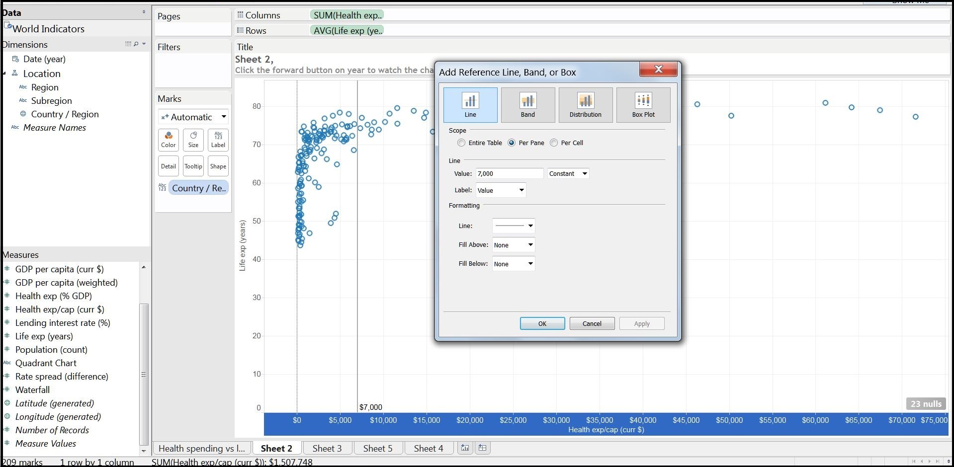
b. A window will pop up to add the reference line. Now Select value of your choice and constant. Here I have selected 7000 as reference axis. Find the image below for more clarification.
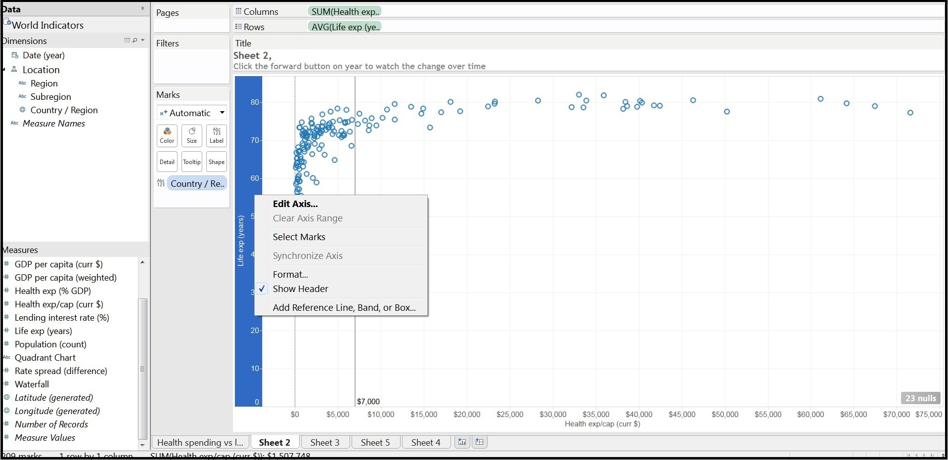
c. Repeat the same for X axis. First right click on the Rows shelf header and select ‘Add Reference Line’
add the reference value of your choice. Here I have taken 75 for reference line.
Step 3: Final Quadrant Chart
Our Quadrant chart is created but to make it more meaningful we’ll be creating a calculated field an adding to the chart.
So go to Analysis > Create Calculated field and create a calculated field as shown below.
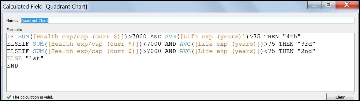
In this calculated field we have grouped the values into 4 parts. It is very simple calculated field and self explanatory as divided according to their values.
IF SUM([Health exp/cap (curr $)])>=7000 AND AVG([Life exp (years)])>75 THEN "4th"
ELSEIF SUM([Health exp/cap (curr $)])<=7000 AND AVG([Life exp (years)])>75 THEN "3rd"
ELSEIF SUM([Health exp/cap (curr $)])>7000 AND AVG([Life exp (years)])<75 THEN "2nd"
ELSE "1st"
END
Now for the next and final step we’ll add this calculated field to the ‘Color’ which can be find in the marks card and that’s done. Customize and format according to your need.
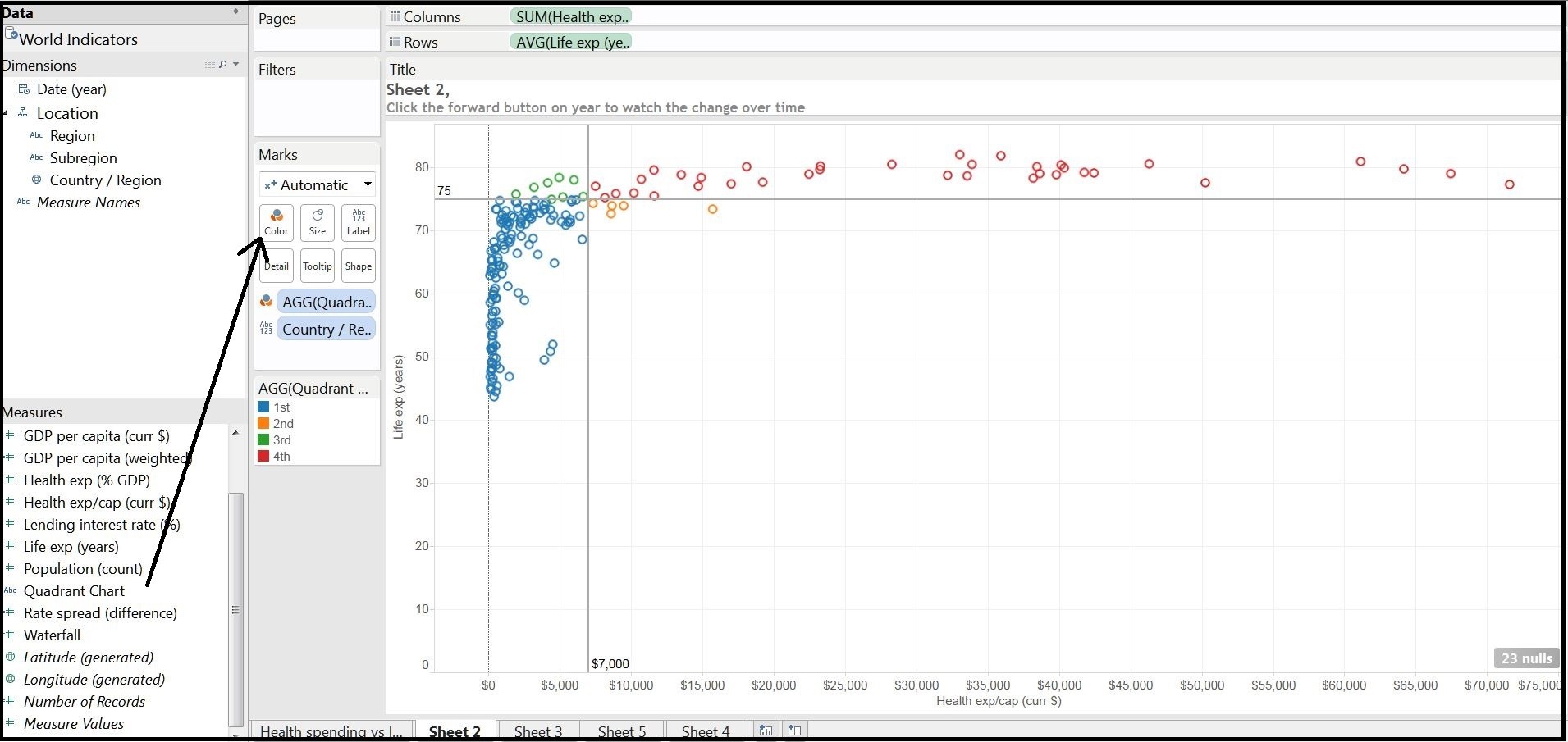
Today we learnt to create Quadrant chart. This chart can be useful in different scenarios such as to show the Sales V/s Quantity etc. Comments and Queries are welcome.
Thanks for the post.
In addition to this I have to work on similar logic.
Business Logic:
I have column Jan 2015 of X company and Jan 2015 of Y Company. Then I have IYA of X company and Y company. Third column will be of Product name
I have to use sum(Jan2015 of X company) – Sum (Jan 2015 of Y Company) as the X – axis.
Then for Y axis I will use sum(IYA 2015 of X company) – Sum (IYA 2015 of Y Company).
And then need to show scatter plot/ Quadrant in which I have to show only Jan 2015 element.
Kindly help on the above logic
Could you share sample workbook?