
Trend arrow Chart (up and down arrows) in Tableau
Some time we just need to visualize data that shows Year over Year (YOY) growth so we don’t have to drill down the data more for the explanation in others words for better and easy understanding of YOY growth we need some better visualization techniques.
Trend arrows are one of the best visualizations for the YOY growth like we have in stock market trending arrows on daily basis.
In this tutorial we’ll be learning to make create the Trend arrows chart in Tableau.
Workbook is attached with the step by step worksheets
Step 1. Creating the chart
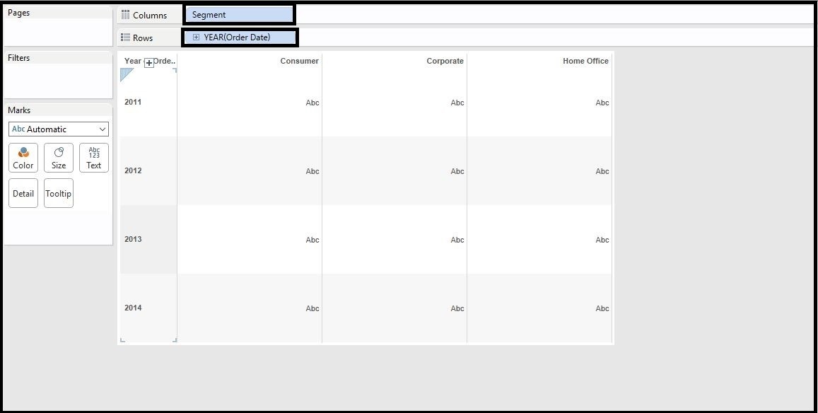
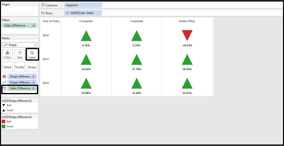
a. Put the Segment in the Columns shelf and Order Date in the Rows shelf
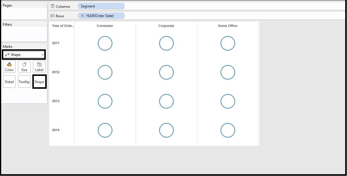
b. Change the chart type to Shapes
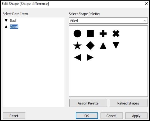
Step 2. Creating the Shapes for different values
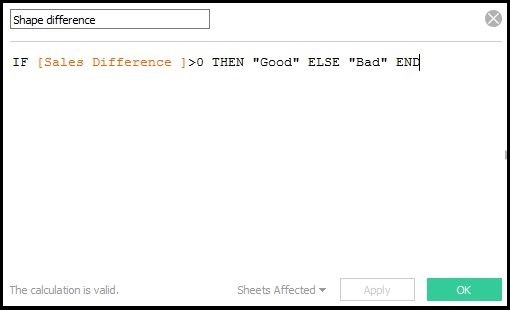
a. Create a Calculated field for the shape for different values “Good” for positive values and “Bad” for negative values and name it ‘Shape difference’ in this case.
b. Now put the calculated field ‘Shape Difference’ in Shape from Marks card
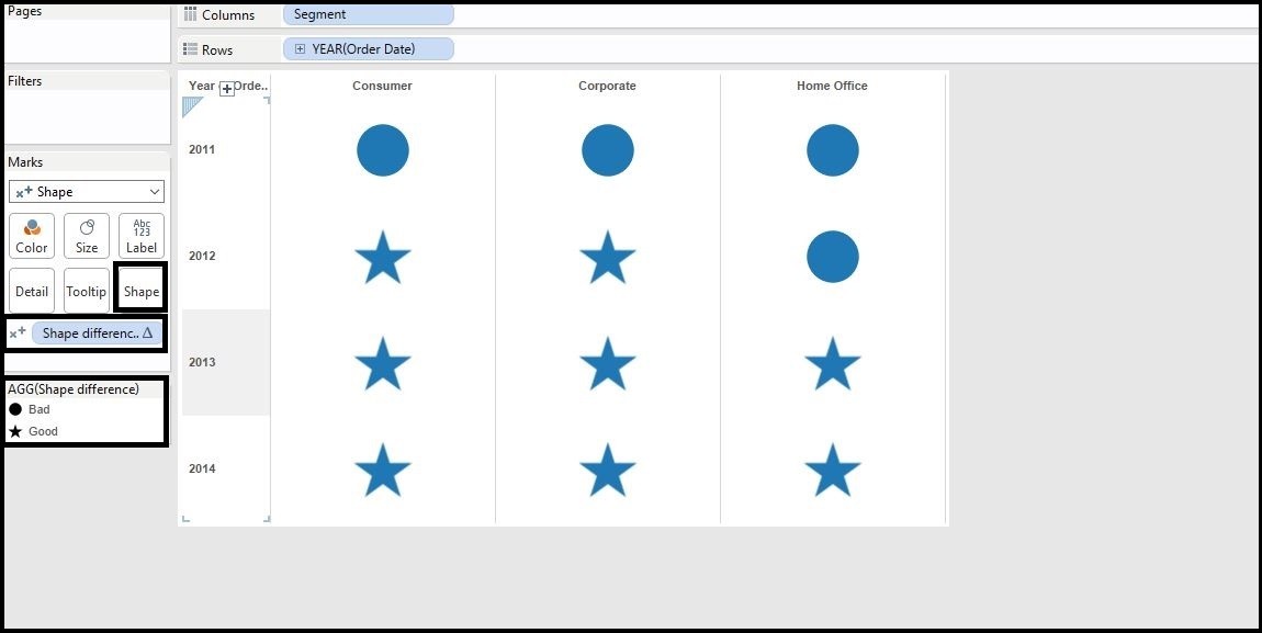
c. Change the shapes for values, Up triangle for Good and Down triangle for Bad
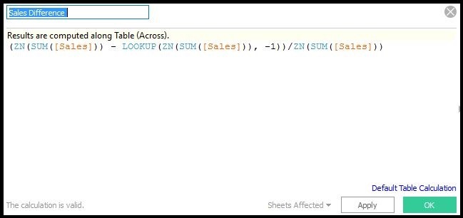
Step 3. Changing the color of shapes
a. Creating a calculated field for the colors it will be calculated in down table and is growth so it will be percentage and name it, here it is ‘Sales difference’
b. Put the ‘Sales Difference’ in filters and ‘Shape Difference’ in colors from the Marks card.
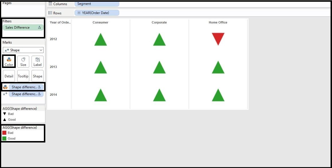
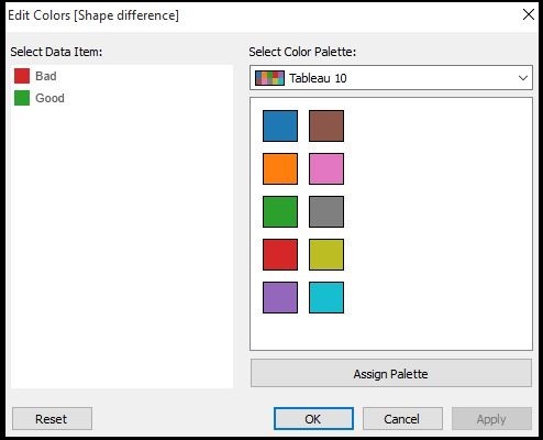
c. Then Change the color for the triangles, Green for Up triangle and Red for the Down triangle
d. Put the sales difference in the labels from the Marks card and set the position according to your need.
For most recent information you have to pay a visit internet and on the web I found this site
as a finest web site for newest updates.
Heya i am for the first time here. I came across this board and I in finding It really helpful & it helped me out much.
I hope to present something again and aid others such as you
aided me.
Thanks for finally talking about >Trend arrow Chart (up and down arrows) in Tableau | Analytics Tuts <Loved it!
Good information. Lucky me I came across your website by accident
(stumbleupon). I have saved it for later!
Hello there! Do you usse Twitter? I’d like to follow you if that would be okay.
I’m undoubtedly enjoying your blog and look forward to new updates.
Follow me at:
Linkedin- https://in.linkedin.com/in/niketkedia
Twitter- @niketkedia
Hi Niket,
Lets say for Example I have a req like sales%,profit%,discount% and Loss% with Up and Down arrows nearby.
These 4 measure values will be changing based on the Period Parameter(YTD,QTD,MTD,WTD,Today)
What will the if Condition look like or is there some other hack to do this
Valuable info. Fortunate me I discovered your site by chance, and I’m
shocked why this twist of fate didn’t took place in advance!
I bookmarked it.
Hi there everyone, it’s my first go to see at this wweb
site, and piece of writing is in fact fruitful for me, keep up posting sjch articles.