
Exploratory data analysis (EDA) in R
Hello friends! today we’ll be see how to do exploratory data analysis (EDA) in R. EDA is an approach to analyse data and start with it read more. I’ve used medical cost data from Kaggle.
Start with loading some packages in R and read data.
library(ggplot2)
library(dplyr)
library(GGally)
library(tidyr)
#read data ins<- read.csv("insurance.csv")
Basic inspection
> head(ins)
age    sex    bmi children smoker    region   charges
1  19 female 27.900        0    yes southwest 16884.924
2  18   male 33.770        1     no southeast  1725.552
3  28   male 33.000        3     no southeast  4449.462
4  33   male 22.705        0     no northwest 21984.471
5  32   male 28.880        0     no northwest  3866.855
6  31 female 25.740        0     no southeast  3756.622
So data has 7 columns which has information demographic info and medical charges.
Lets check the data and columns structure.
>str(ins)
'data.frame':	1338 obs. of  7 variables:
$ age     : int  19 18 28 33 32 31 46 37 37 60 ...
$ sex     : Factor w/ 2 levels "female","male": 1 2 2 2 2 1 1 1 2 1 ...
$ bmi     : num  27.9 33.8 33 22.7 28.9 ...
$ children: int  0 1 3 0 0 0 1 3 2 0 ...
$ smoker  : Factor w/ 2 levels "no","yes": 2 1 1 1 1 1 1 1 1 1 ...
$ region  : Factor w/ 4 levels "northeast","northwest",..: 4 3 3 2 2 3 3 2 1 2 ...
$ charges : num  16885 1726 4449 21984 3867 ...
Children is discrete values so changing it to factors.
ins$children<- as.factor(ins$children)
Lets check some vizzes
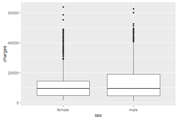
Plot1 <- ggplot(ins, aes(sex,charges))+geom_boxplot()
Male median medical charges are more than female.
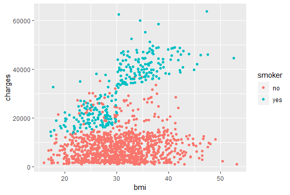
Smokers v/s Non-smokers
Plot2 <- ggplot(ins, aes(bmi,charges, col=smoker))+geom_point()
Clearly smokers are paying more medical charges than non-smokers.
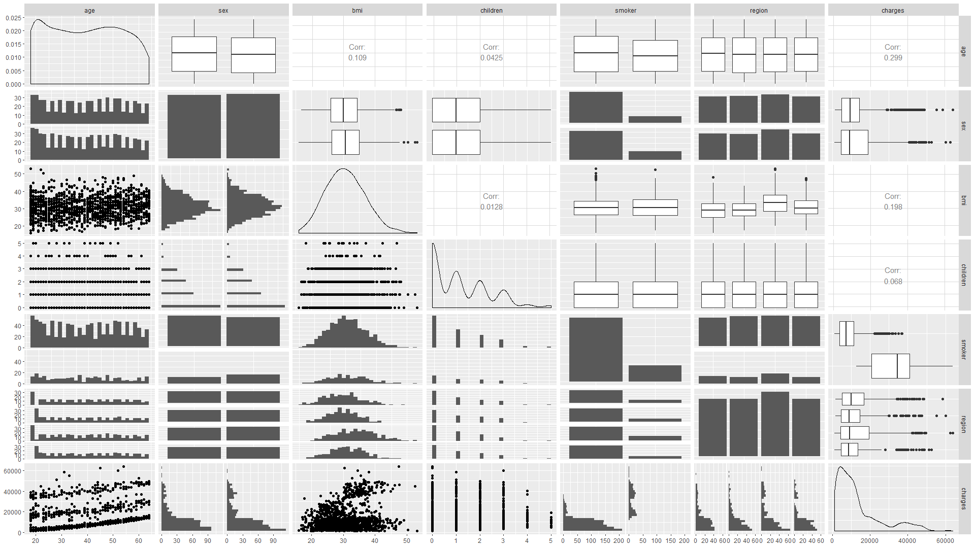
Plot3 <- ggpairs(ins)
Plotting ggpairs and checking the relationship.
Smokers v/s non-smoker Parents
Mother
> ins %>% filter(children!=0,sex=="female") %>% group_by(smoker) %>%
summarise(Avgbmi= mean(bmi), AvgCharges= mean(charges), n=n())
smoker Avgbmi AvgCharges     n
1 no       30.7      9577.   311
2 yes      29.0     30674.    62
Father
> ins %>% filter(children!=0,sex=="male") %>% group_by(smoker) %>%
summarise(Avgbmi= mean(bmi), AvgCharges= mean(charges), n=n())
smoker Avgbmi AvgCharges     n
1 no       30.8      8509.   294
2 yes      32.0     33770.    97
Average medical charges for smoker fathers are more than smoker mothers.
Checking region effects
> ins %>% group_by(region) %>%
+ summarise(Avgbmi= mean(bmi), AvgCharges= mean(charges), n=n())
  region    Avgbmi AvgCharges     n
1 northeast   29.2     13406.   324
2 northwest   29.2     12418.   325
3 southeast   33.4     14735.   364
4 southwest   30.6     12347.   325
Southeast region population paying more for medical charges.
for different age group also southeast region is paying the most
> ins %>% group_by(agegp,region) %>%
+ summarise(Avgbmi= mean(bmi), AvgCharges= mean(charges), n=n())
   agegp region    Avgbmi AvgCharges     n
1 18-25 northeast   28.6      9179.    73
2 18-25 northwest   28.5      8245.    76
3 18-25 southeast   33.7     10431.    84
4 18-25 southwest   28.7      8325.    73
5 25-35 northeast   28.0     10891.    64
6 25-35 northwest   28.7     10436.    64
7 25-35 southeast   33.0      9755.    74
8 25-35 southwest   30.8     10999.    66
9 35-45 northeast   28.3     14448.    64
10 35-45 northwest   29.6     11070.    64
11 35-45 southeast   32.2     15933.    73
12 35-45 southwest   30.5     12159.    63
13 45-55 northeast   30.7     16241.    70
14 45-55 northwest   29.7     15513.    68
15 45-55 southeast   34.0     18402.    76
16 45-55 southwest   30.8     13571.    70
17 55+   northeast   30.4     17264.    53
18 55+   northwest   29.7     18450.    53
19 55+   southeast   33.9     21122.    57
20 55+   southwest   32.8     18173.    53
Again for different age group also southeast region’s medical charges are the highest.
Ratio of medical charges for different ages
> Agecharges <- ins %>% group_by( age,sex, smoker)
%>% summarise(AvgCharges= mean(charges))
> spread(abc2, key = smoker, value = AvgCharges)
age   sex       no    yes
1 18    female 3717. 26862.
2 18    male   2696. 24779.
3 19    female 3880. 24897.
4 19    male   3220. 29106.
5 20    female 2484. 19523.
6 20    male   4863. 28616.
7 21    female 4516. 15359.
8 21    male   3211. 17942.
9 22    female 2706. 34752.
10 22    male   2396. 38684.
# ... with 84 more rows
Spreading across different ages and smoker gives a better picture and the smokers
are paying almost 10 times the non-smokers.
This tutorial is just to create a base for the EDA. I’ll add linear regression model with some more examples.
Further readings:
Keep visiting Analytics Tuts for more tutorials.
Thanks for reading! Comment your suggestions and queries.
Before diving in, think about what you’re trying to discover. What questions are of interest? You will first walk through an analysis of the dataset. What does it look like? How many songs are there? How are the lyrics structured? How much cleaning and wrangling needs to be done? What are the facts? What are the word frequencies and why is that important? From a technical perspective, you want to understand and prepare the data for sentiment analysis, NLP, and machine learning models.