
Plot multiple charts in single layout in base R
Hello friends! Today we’ll be learning to create multiple charts in single layout in base R.
I’ll be using the Pokemon dataset from Kaggle. I’ll be doing density plot using different variables.
Reading data and separating legendary and non-legendary Pokémon’s
df <- read.csv("Pokemon.csv")
#sepratering legendary and non-legendary Pokémon's
df1 <- df [df$Legendary== "True",]
df2 <- df [df$Legendary== "False",]
Creating the layout to plot multiple chart
layout(matrix(c(1,2,3,4,5,6,7,7,7),3, 3, byrow = TRUE))
#total 7 charts: 6 charts in 2 rows and last row has 1 chart but full width
Creating charts (total 7): run line by line to understand the code better
#---HP
dx <- density(df1$HP)
plot(dx, lwd = 2, col = "red",
main = "HP", xlab = "")
polygon(dx, col="red", border="blue")
dy <- density(df2$HP)
lines(dy, col = "blue", lwd = 2)
polygon(dy, col="blue", border="blue")
#----ATTACK
dx <- density(df1$Attack)
plot(dx, lwd = 2, col = "red",
main = "Attack", xlab = "")
polygon(dx, col="red", border="blue")
dy <- density(df2$Attack)
lines(dy, col = "blue", lwd = 2)
polygon(dy, col="blue", border="blue")
#---Sp..Def
dx <- density(df1$Sp..Def)
plot(dx, lwd = 2, col = "red",
main = "Sp..Def", xlab = "")
polygon(dx, col="red", border="blue")
dy <- density(df2$Sp..Def)
lines(dy, col = "blue", lwd = 2)
polygon(dy, col="blue", border="blue")
#----Sp..Atk
dx <- density(df1$Sp..Atk)
plot(dx, lwd = 2, col = "red",
main = "Sp..Atk", xlab = "")
polygon(dx, col="red", border="blue")
dy <- density(df2$Sp..Atk)
lines(dy, col = "blue", lwd = 2)
polygon(dy, col="blue", border="blue")
#---Defense
dx <- density(df1$Defense)
plot(dx, lwd = 2, col = "red",
main = "Defense", xlab = "")
polygon(dx, col="red", border="blue")
dy <- density(df2$Defense)
lines(dy, col = "blue", lwd = 2)
polygon(dy, col="blue", border="blue")
#----Speed
dx <- density(df1$Speed)
plot(dx, lwd = 2, col = "red",
main = "Speed", xlab = "")
polygon(dx, col="red", border="blue")
dy <- density(df2$Speed)
lines(dy, col = "blue", lwd = 2)
polygon(dy, col="blue", border="blue")
#----Total
dx <- density(df1$Total)
plot(dx, lwd = 2, col = "red",
main = "Total", xlab = "")
polygon(dx, col="red", border="blue")
dy <- density(df2$Total)
lines(dy, col = "blue", lwd = 2)
#----adding legend
legend("topright",
legend = c("Legendary", "Non Legendary"),
col = c("red",
"blue"),
pch = c(19,19),
bty = "n",
pt.cex = 2,
cex = 1.2,
text.col = "black",
horiz = F ,
inset = c(0.0, 0.0))
polygon(dy, col="blue", border="blue")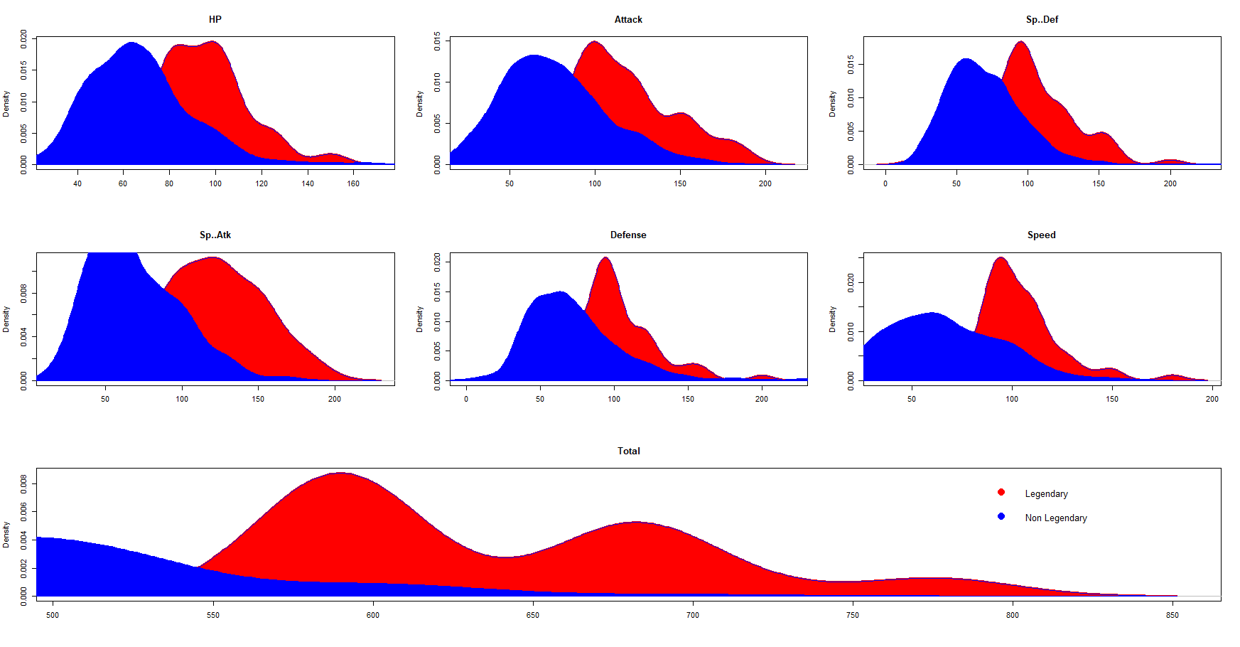
Keep visiting Analytics Tuts for more tutorials.
Thanks for reading! Comment your suggestions and queries
Pingback: Arrange multiple plots using patchwork in R - Analytics Tuts