
Profit Gap Analysis in Tableau
Hello friends! Today we’ll be learning how to do profit analysis in Tableau using the floating bar chart. As you can see in the image the final output.
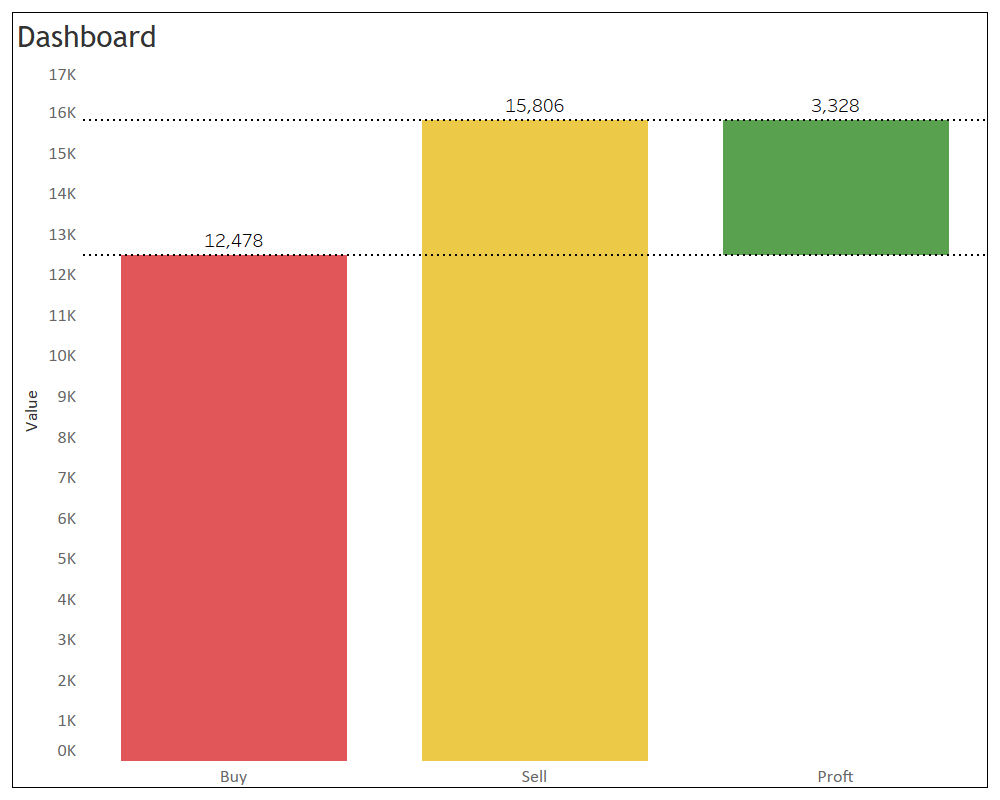
Final Output
The data is in column format. Also as you can see the buy and sell values are in the same column so there is no direct way to create the chart
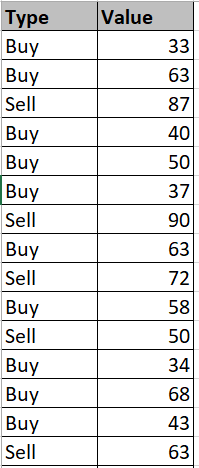
Data
To achieve that we’ll create few calculated fields to separate out the values
Buy
IF [Type]= "Buy" THEN [Value]
ELSE 0
END
Sell
IF [Type]= "Sell" THEN [Value]
ELSE 0
END
Difference
({ FIXED Type : sum(([Sell])-([Buy]))})
Profit
SUM([Buy])
Now we’ll create the chart. Find the image below for developing the chart also steps to do so. Steps to achieve the result and check the image for quick reference and if you want to go through the steps:
1. Place ‘Measure Names’ to Columns shelf
2. Place ‘Measure Values’ and calculated field ‘Profit’ to Rows self. Make it dual axis
3. Place ‘Measure Names’ to filter
4. Make ‘Measure Values’ chart type to bar chart
5. Make ‘Measure Values’ chart type to Gantt chart
6. Place calculated field ‘Difference’ to size
7. Select ‘Buy’ and ‘Sell’ from the filter
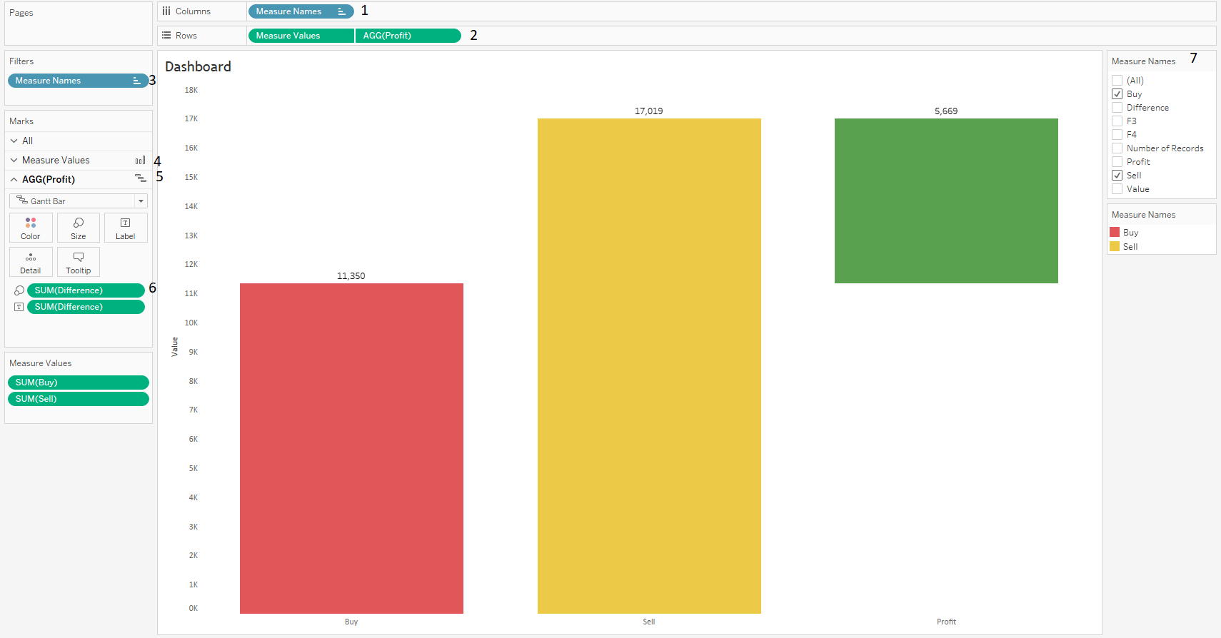
Profit gap analysis chart development
Once you follow the steps you’ll be able to see the output. With some basic formatting changes Final outcome will look something like this and click on the image to interact with.
Final Output
Thanks Deepak for helping me achieving this.
Keep visiting Analytics Tuts for more tutorials.
Thanks for reading! Comment your suggestions and queries.
A good tutorial to learn Tableau from basics.
Pingback: Target vs Actual Chart in Excel - Analytics Tuts
Awesome!