
Target vs Actual Chart in Excel
Hello friends!! We’ll be learning how to create bar and stack bar in single chart in Excel. I’ve done something similar in Tableau in my previous post Profit Gap Analysis in Tableau. Also I’ve attached workbook to download and reuse.
Suppose you want to show the Target, achieved and yet to achieve in single chart how will you show in excel. I recently got something similar requirement to do in excel. Quick and easy to follow excel tutorial even if you are new to Excel charts.
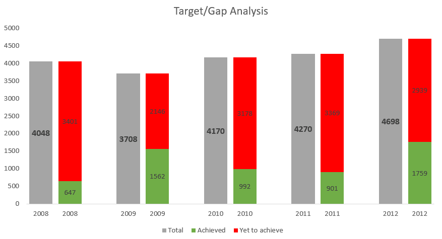
By end of the tutorial we’ll be having something like image below
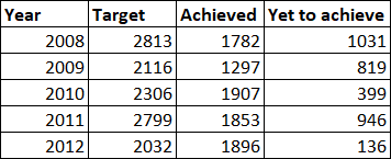
Data
I had the data in following format; with Year, Target, achieved and yet to achieve in three separate columns. Sometimes advantage of Excel is that it works on cell level so data can be transformed easily.
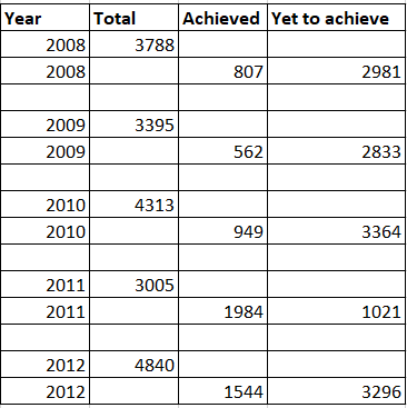
Transform the data
We’ll transform the data in following format. 2 rows for Year with same columns as we have in raw data but target in 1st row and other two values in 2nd row and 3rd blank row for spacing between the bar charts which is helpful for user readability It is always advisable to create a backup sheet and use that sheet for data instead of using raw data directly.
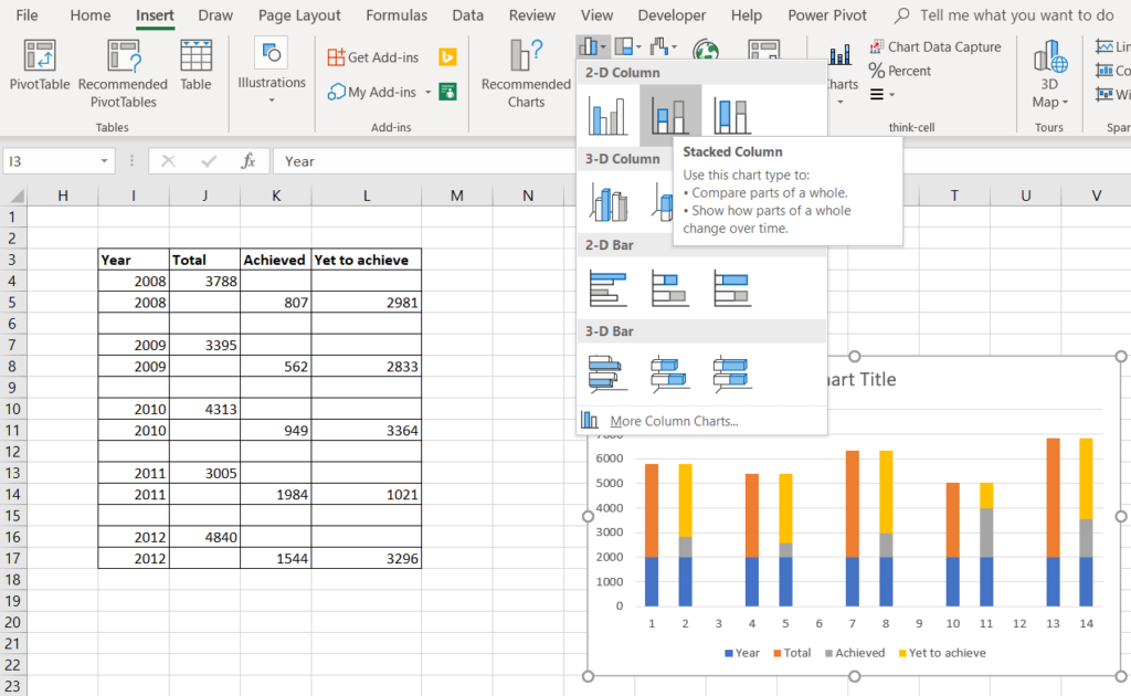
Creating chart
Once the data in required shape. Select the data range and insert the stack column chart.
Basic formatting in chart
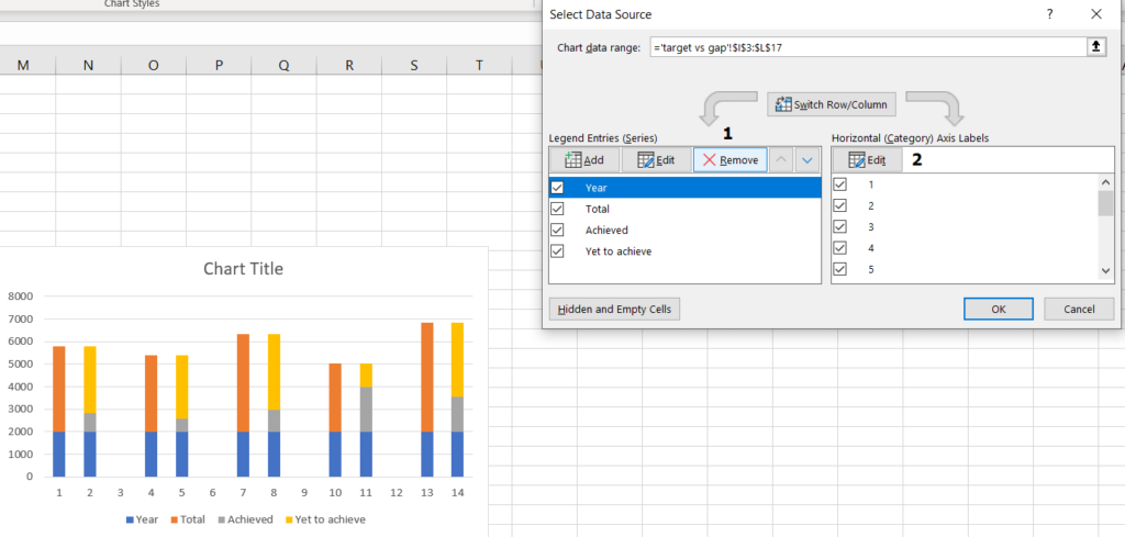
Once you have the chart you’ll see that there are numbers instead of Year in the axis. To get the axis, right click on the chart and click ‘Select Data’. You’ll get the dialogue box there:
1. Select Year and remove it
2. From right area for ‘horizontal axis labels’ click edit and select the Year column range to get the axis label
So it was about the creating bar and stack bar in single chart in.
Download the workbook here!
Keep visiting Analytics Tuts for more tutorials.
Thanks for reading! Comment your suggestions and queries
do you have the excel sheet still? the link doesn’t work
drop your email, I’ll share the file.