
How to assign custom Shapes Axis Labels in Tableau
Today we’ll be learning to assign custom shapes to the axis labels in Tableau dimension values. If you’re beginner
please check out the following tutorials first it will helpful to follow the tutorial: Custom Shapes in Tableau and How to create Dual Axis Chart in Tableau
Steps to create the viz
Create a chart by placing measure and dimension in relevant shelf. Now check the range of the values you get in the chart. Like here for my bar graph the range in 0 to 95 which means the value can lie between 0 to 95.
Depends on your measure range change the calculated field, here I named it as Position. here the maximum value is 95 so I’m taking the value as -5 and calculation AVG(-5)
AVG(-5)
a. Why 5? because it should be relative to the range of your chart. If the range is 0 to 1000 you have to adjust the value according to that.
b. Why negative value? Since we’ll gonna create dual axis and axis labels are always comes before the actual values and so do the shapes. You’ll see in the following steps.
create the chart as shown below. Put your measure in column shelf and dimension in rows shelf and the ‘Position’ calculated field in column shelf for dual axis as shown below.
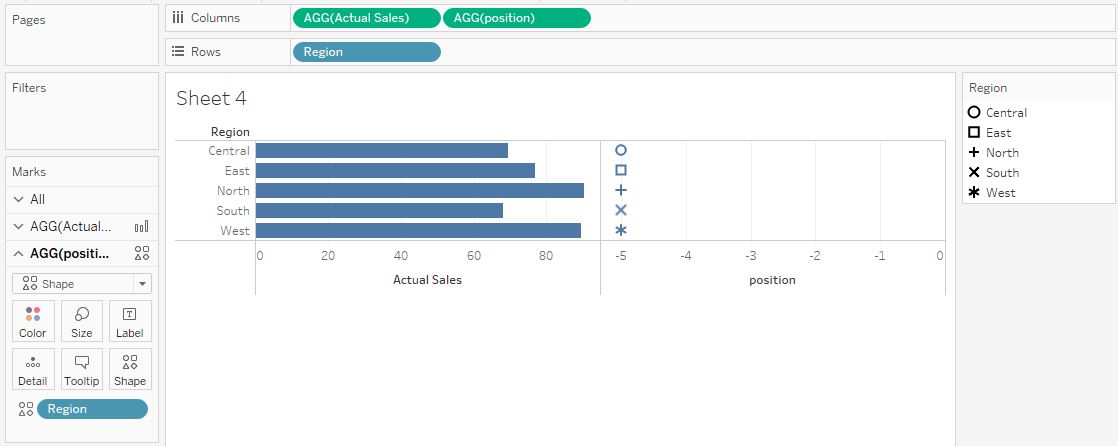
Now right click on the Position calculated field in from the columns shelf and click on the dual axis. After that click on any axis and synchronize the axis.
Now change the chart type of Position calculated fields as ‘Shapes‘ and bar for other measure. Put the dimension field, Region in this case in the shapes option.
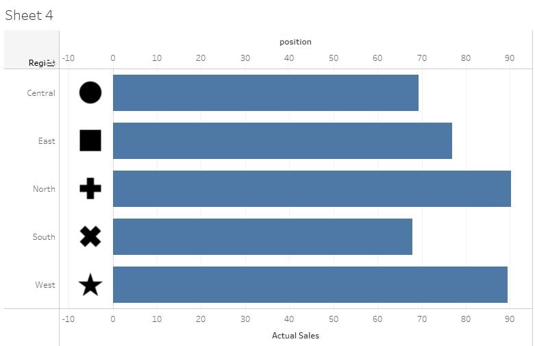
Format it according to your need and that’s done. Easy and useful method with multiple application for tableau visualization.
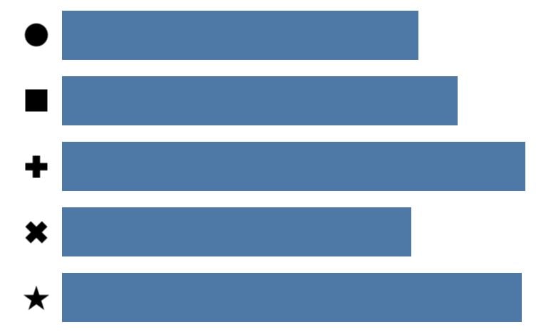
Final Viz
I have skipped few steps check out the following tutorials to create:
Custom Shapes in Tableau and How to create Dual Axis Chart in Tableau
Thanks for reading! Comment your suggestions or queries.
Keep visiting Analytics Tuts for more tutorials.