
Waterfall Chart in Tableau
Today we’ll be learning to make Waterfall chart in Tableau. I have used ‘World Indicators’ data for the tutorial. Tableau workbook is attached for download.
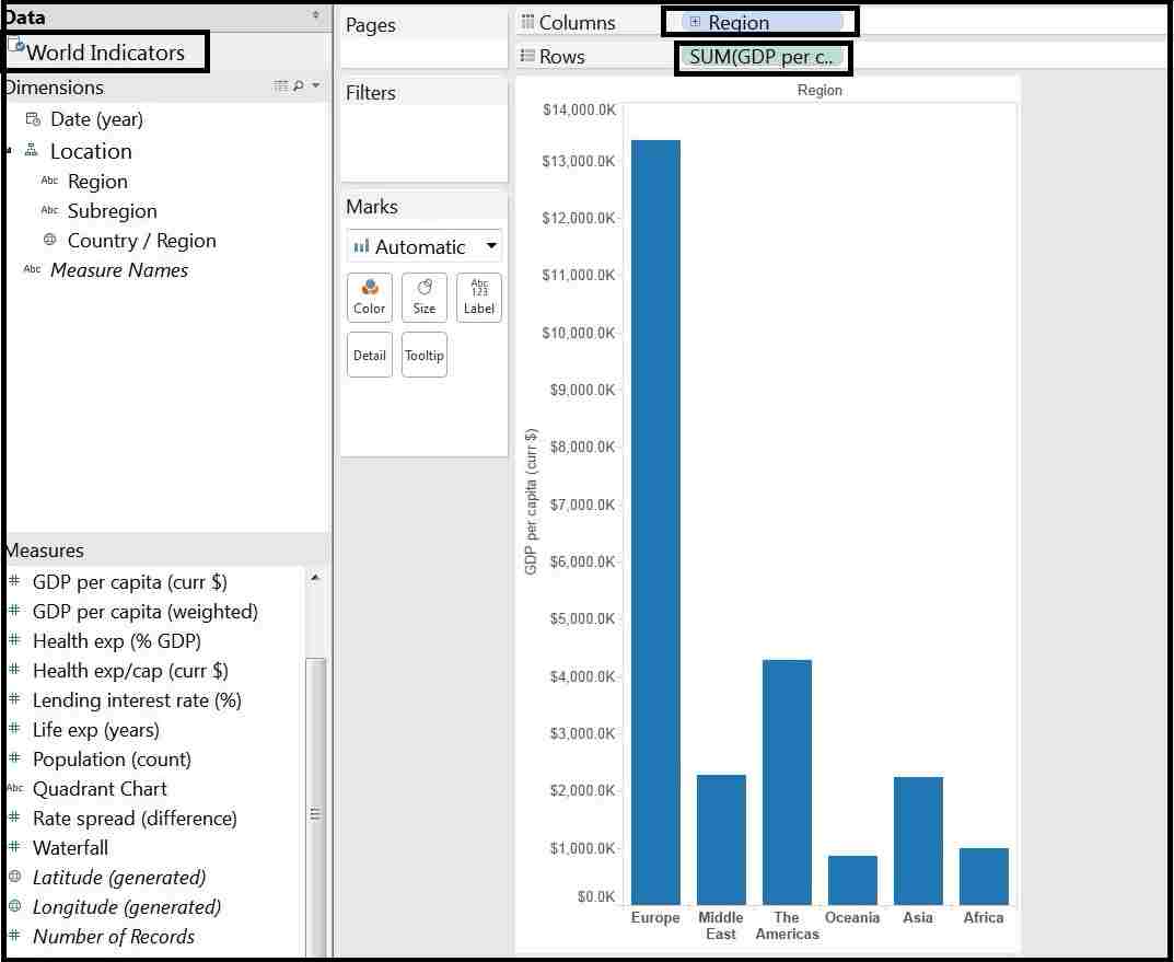
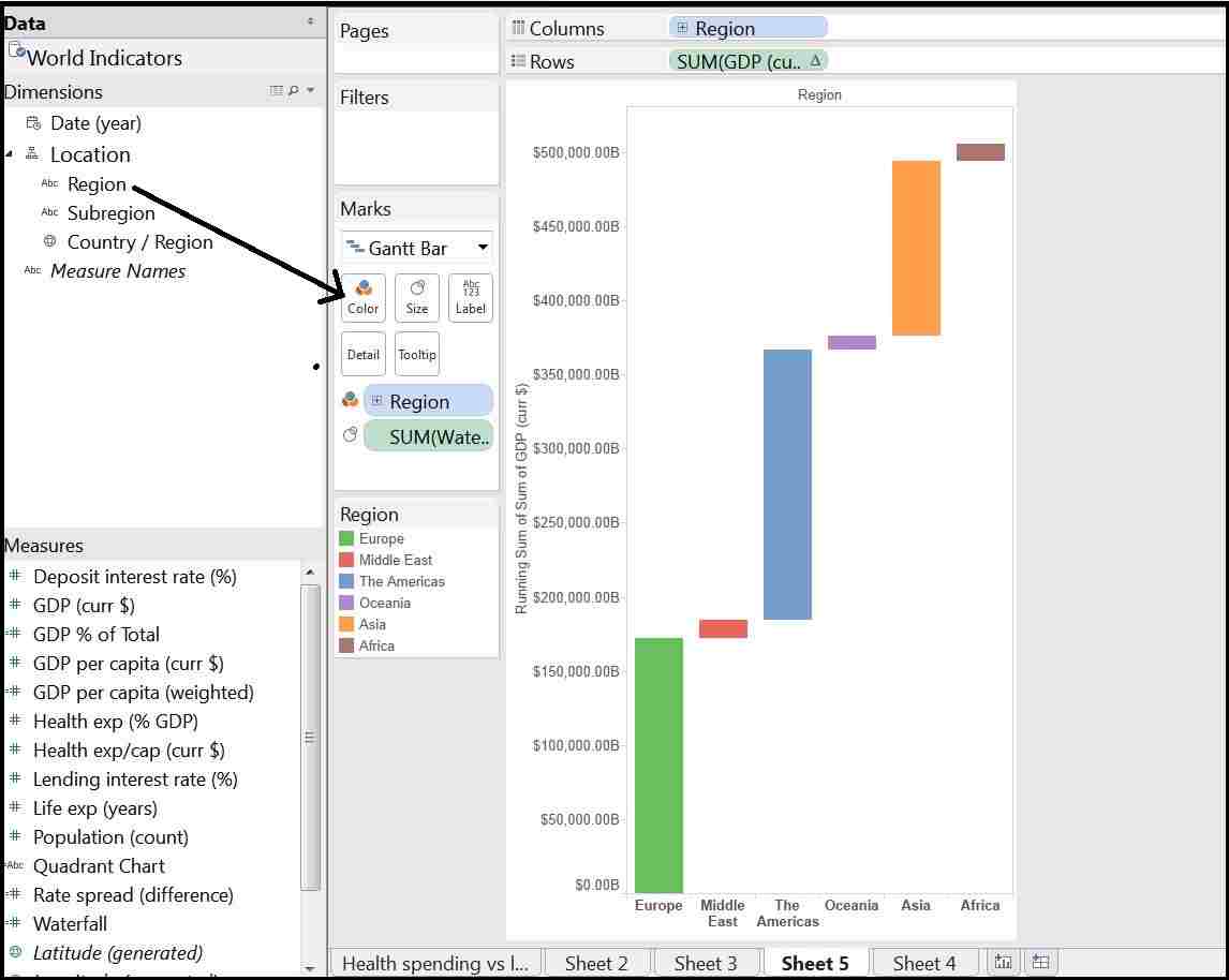
Step 1. Creating a bar chart
Put the ‘Region’ Dimension in Columns shelf and ‘GDP per capita(curr $)’ Measure in Rows shelf.
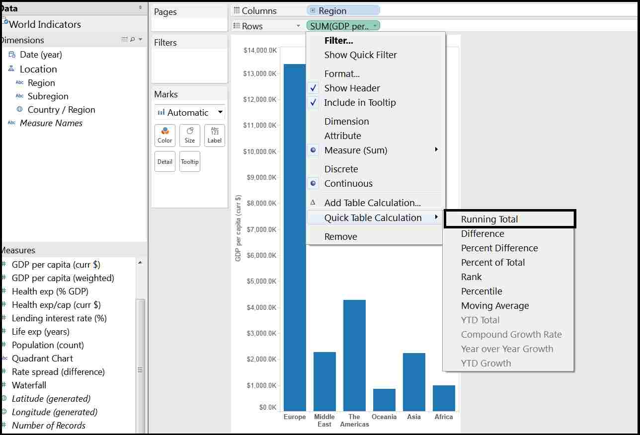
Now from the rows shelf click on the drop-down menu of ‘GDP per capita’ measure and select Quick table calculation > Running total
Now select ‘Gantt Bar’ chart from marks card.
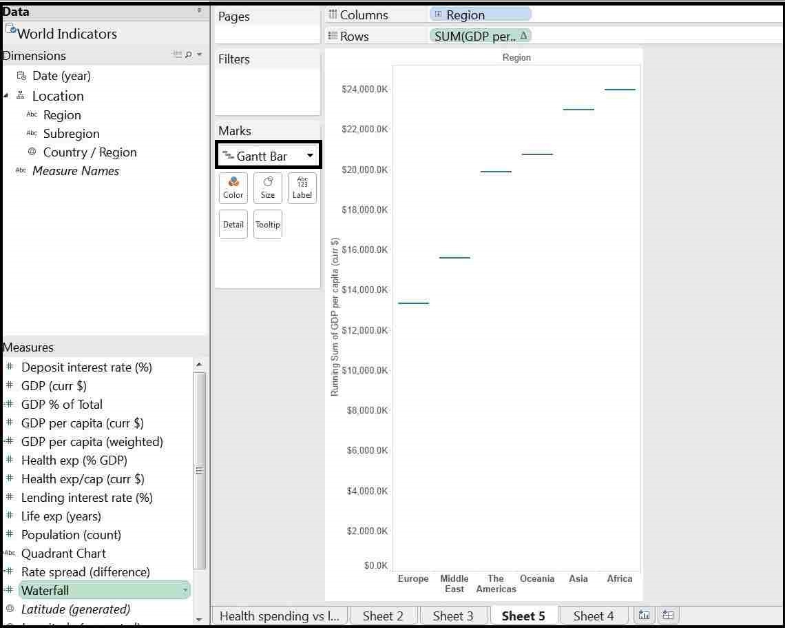
Step 2. Creating Waterfall chart
In this step we’ll be creating final waterfall chart.
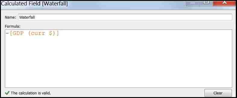
Go to Analysis> Create calculated field and create a calculated field as shown below.
Now Put this calculated field in the Size from marks card and for different colors put the Region in Colors.
and that is done, it was very simple to create the waterfall chart. Keep visiting for more analytics tutorials.
also check out Waterfall Chart (in Percentage) in Tableau